
How Freshly Cooked help capture the soul of a multi-disciplinary brand through storytelling, illustration, and motion design.
Promo Package
Enhancing Brand Visibility: Those 3 Reps' Strategic Motion Design Collaboration with Freshly Cooked
Those 3 Reps (TTR), a prominent artist representation agency, sought to elevate their brand presence within a competitive market. Their objective was to develop a dynamic promotional video for use at industry events and on their digital platforms. Recognizing the need to differentiate themselves, TTR partnered with Freshly Cooked to create compelling visual content that would captivate their target audience. This collaboration resulted in a comprehensive suite of digital assets that significantly enhanced TTR's brand visibility and engagement.
The Brief
In a landscape saturated with creative agencies, TTR aimed to establish a distinct and premium brand identity. Their primary challenge was effectively conveying their value proposition and the caliber of their represented artists. The secondary goal was to create something that captured TTR’s personality, aesthetics, or soul (aka Brand). Specifically, they required a solution that would:
Increase brand visibility at industry events.
Clearly communicate their services and expertise.
Ensure seamless video playback across diverse display formats without redundant production.
The need for a versatile and impactful visual strategy was paramount to TTR's strategic growth objectives. We put our heads together and created a roadmap, aka Creative Brief, to outline the objectives, goals, deliverables, a timeline breakdown, and all the other nitty-gritty details.
The Approach
Freshly Cooked adopted a collaborative and iterative approach to address TTR's needs. Initial consultations revealed a desire for a comprehensive narrative video. However, through strategic advisement, we refined the scope to focus on a concise, impactful promotional piece.
Our process encompassed the following key stages:
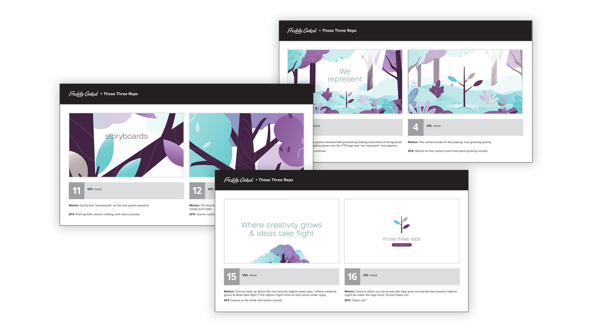
Conceptualization, Visual Development and Storyboarding: We developed a detailed storyboard, complemented by a curated mood board, to establish a vision for TTR's brand identity’s unique style.
Style Development: After narrowing our approach, we created a custom illustration style that resonated with TTR's aesthetic and effectively communicated their brand message.
Animatic Development: To visualize the moment, the animatic brought the timing and transitions to life, allowing for client feedback and refinement before full animation production.
Animation and Production: We utilized tools such as Procreate, Adobe Illustrator, After Effects, and Premiere Pro to produce a high-quality animated video optimized for various display formats.
Asset Expansion: Recognizing the potential for broader application, we extended the visual style to create supplementary marketing assets, including digital backgrounds, event displays, and promotional materials.
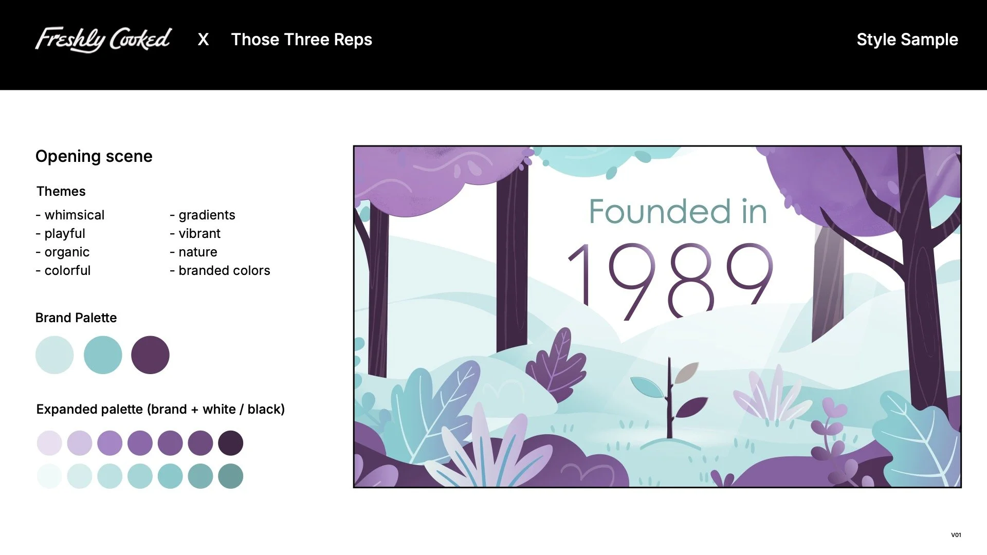
Style Development
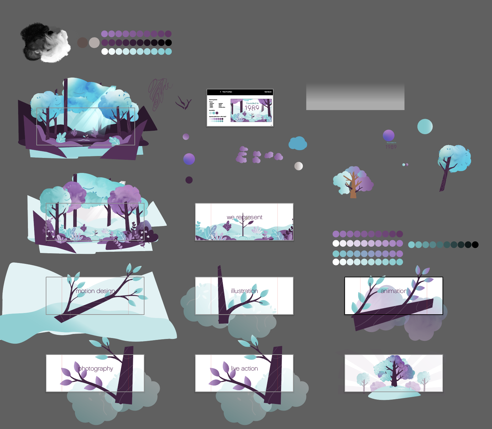
With the TTR logo as our central visual anchor, we aimed to create a world that felt intrinsically connected to it. This seemingly simple goal involved an intricate exploration: we deconstructed the logo, revealing its essential geometric forms and studying how it was created. These core shapes then became the foundational elements, informing the design language of the entire environment. The sapling needed to look full-grown and believable that it was the same tree.
Exploratory sketches and brainstorming sessions helped to define the overall mood, character expressions (if applicable), and key environmental elements. This stage was crucial for establishing the visual language and ensuring a cohesive artistic direction before diving into the specifics of the animation.
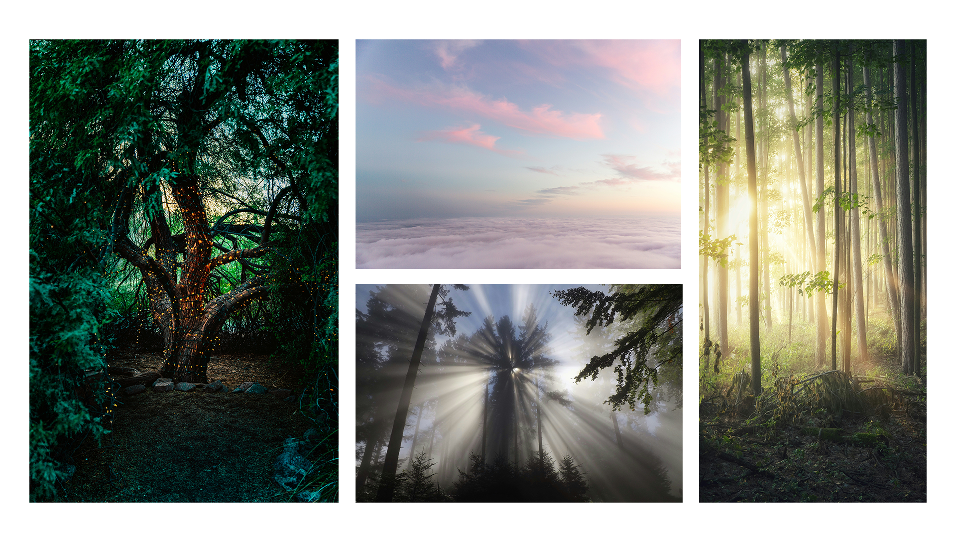
In looking at inspirations of magical forests and studying light leaking through tree leaves, we realized that expanding on the TTR color palette was imperative. We wanted to honor the base colorings, but to show a world of complexity, color shifts, and subtle light leaks, we quickly realized we needed more colors. By adding tints and shades (adding white or black) to the core brand colors, we built out a 20-shade color scheme that still looked and felt like TTR.

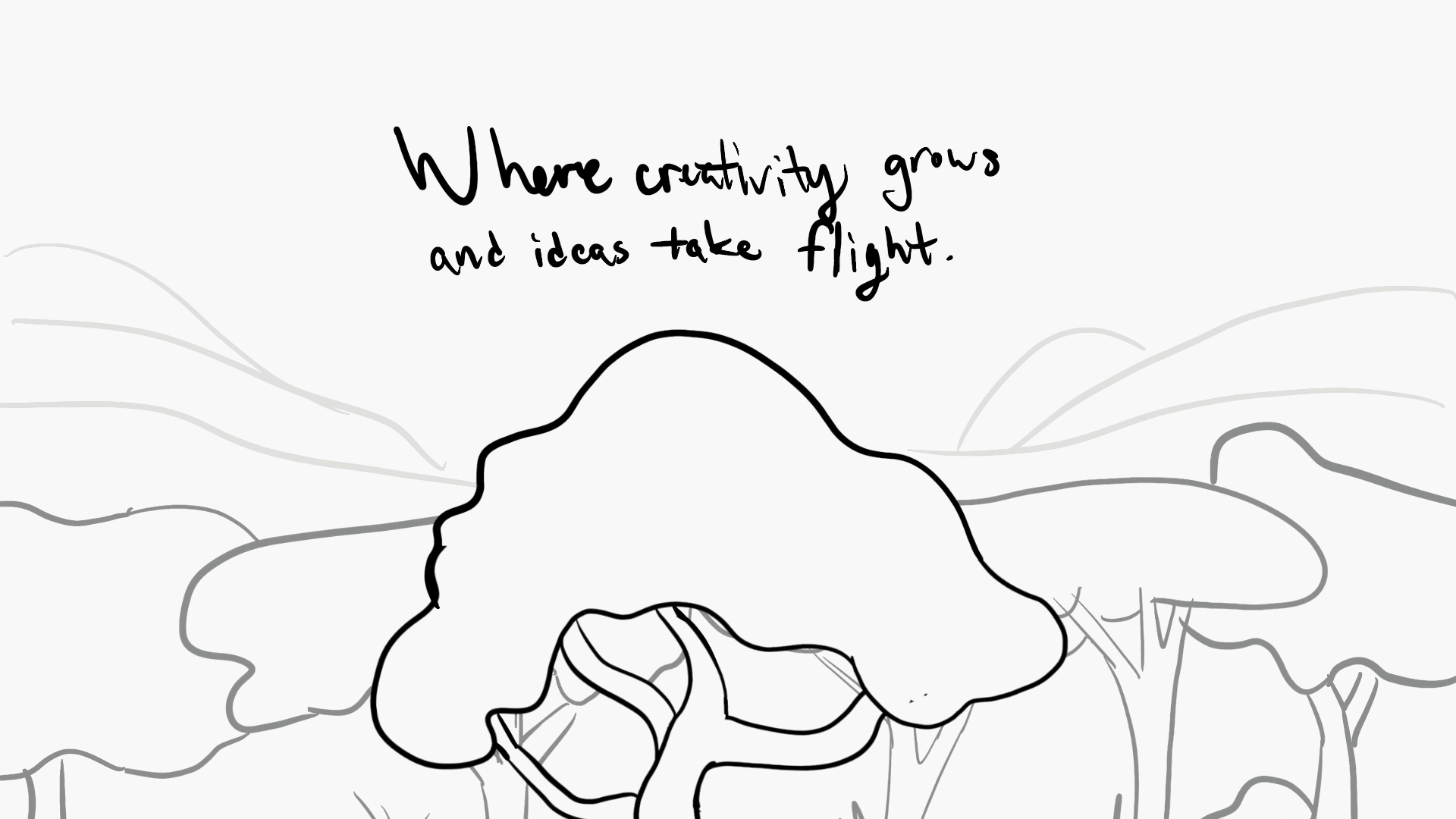
Conceptualization and Storyboarding
Following this initial conceptualization, the process moved into rough storyboarding. This involved creating a sequence of quickly sketched panels to outline the major actions, camera angles, and overall flow of the scene. The emphasis at this stage was on capturing the essential movements and spatial relationships without getting bogged down in detail.
The rough storyboard served as a dynamic blueprint, allowing for early adjustments to pacing, composition, and the impact of key moments. It was a flexible tool for visualizing the scene's progression and identifying potential challenges or areas for improvement in the animation's storytelling.
One the rough storyboard was set, we dove into the vectorized visuals and built the final storyboard. It detailed visual guide for the subsequent animation process, clearly communicating the intended framing, pacing, and transitions between shots. By defining the big movements and overall composition in the initial rough stage before moving to the vectorized final storyboard, we ensured a strong foundation for the animation's visual storytelling and streamlined the production pipeline.
The Messy Files
We got down and dirty with the file execution and exploration. Our Illustrator files were bursting at the seams with all the color explorations, layered foliage, and opacities. (And there were specific visuals we tried, and discarded, because it didn’t have the right look.
Speaking of getting into it, we went full-on with the light leaks! It was all trial and error: tweaking the intensity, finding the perfect angle, figuring out that sweet spot before it just washed everything out. We got deep into the details!
Normally, we're all about having clean, tidy, and organized that fit nicely nicely inside the artboards. But this animation? Nope. It was bigger than our usual projects. So, we threw caution to the wind and really used every inch of that workspace as our digital playground.
Here’s a sneak peek into our live files!

Building the Details
To achieve the complex layered effect of parallax scrolling in our animation, we committed to creating comprehensive illustrations of all foliage components, including every part of each plant, tree, and hill. This exhaustive approach guaranteed seamless visuals as the camera traversed the scene, preventing any elements from appearing cut off. Although building this detailed world for TTR was a demanding process, it was a labor of love.
We also strategically introduced subtle gradients at this point to cultivate a feminine, soft, and ethereal ambiance, like sunlight delicately filtering through the canopy.
The Final Result: 4 Video Formats
1920×1080 - Standard video format
1080×1920 - Stories, Reels, TikTok, and Youtube Shorts
1200×1200 - Instagram, and square format platforms
1080×1350 - Portrait format
Branded Extras
Our work didn't end with the video. We leveraged the created graphics to develop a comprehensive branded experience, extending the visual language into elements like stickers, a multi-piece backdrop concept, and virtual backgrounds for video communication.

Conclusion/Takeaways
The collaboration between Freshly Cooked and Those 3 Reps culminated in delivering a versatile and impactful promotional video and a suite of complementary marketing assets. This project demonstrates the unique branding and illustration capabilities that come along with designing an animation, because you need a complete look and feel to bring motion to life.
On the surface, it looks like all we did was create a cool video (which we did), but it’s so much more than that: it’s a top-to-bottom branded experience that will continue being utilized over again both in video and still formats.